|
|

Your
artwork should, in some way, be representative of you…your
vocal style or quality, personality, quirkiness, or some other aspect
of who you are. It should establish your identity and, hopefully,
a lasting impression.
Samples:
Page 1 | Page 2 | Page
3 | Page
4 | Page 5
|
Sherri
Berger Marketing Pieces:
If
you’re lucky enough to have a name that can be used cleverly
in your marketing and promotion, our motto is: use it and abuse
it. With the name Berger, I went for the obvious…creating
an identity with hamburgers and maintaining consistency and continuity
with the burger theme, whether it be a 50’s diner motif,
hamburgers or other food images.
The
Postcards:
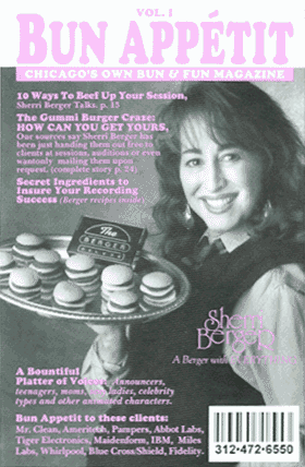
We
rarely recommend using your photo to promote yourself, especially
if you’re new to the business or if your voice is very different
from how you look; but this was just a post card and at the time,
I was pretty well known and wanted to promote my gummy burger
giveaways using the magazine cover motif. The cover seemed like
a perfect way to incorporate my trademark style of food puns.
After about eight months of use, this piece was replaced by the
roller-skate carhop. Completely different postcards, yet consistent
in theme.
|


|
|
The
Business Card:
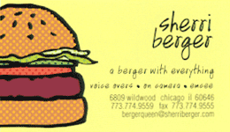
A
few years ago, I came out with a new CD and completely updated
all marketing and promotional materials. It was time for a hipper,
less cartoony look…  still
incorporating the hamburger, but now with eye-popping graphics
and full color. I wanted my business card to make a bold statement
of fun as well. Choosing yellow for the background along with a
huge hamburger graphic was a deliberate move to give it that stand-out-I’m-not-a-part-of-corporate-America
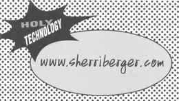
punch. Since printing was free on the second side, I decided to
use the space for all the technology info, picking up the starburst
motif from the CD and website. still
incorporating the hamburger, but now with eye-popping graphics
and full color. I wanted my business card to make a bold statement
of fun as well. Choosing yellow for the background along with a
huge hamburger graphic was a deliberate move to give it that stand-out-I’m-not-a-part-of-corporate-America
punch. Since printing was free on the second side, I decided to
use the space for all the technology info, picking up the starburst
motif from the CD and website.
|
|
|
|
|

![]()
![]()